The client
Kent Brewery (UK) was founded in 2011 with a clear ambition: to brew distinctive, flavourful beers and lead Kent in a bold new direction. Their beers are never bland or ordinary — they’re proof of how much more can be achieved through the art and craft of brewing.
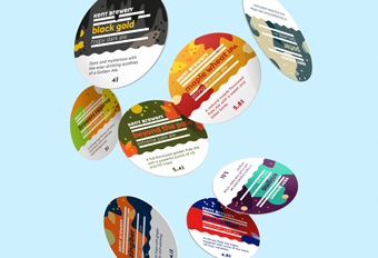
The design
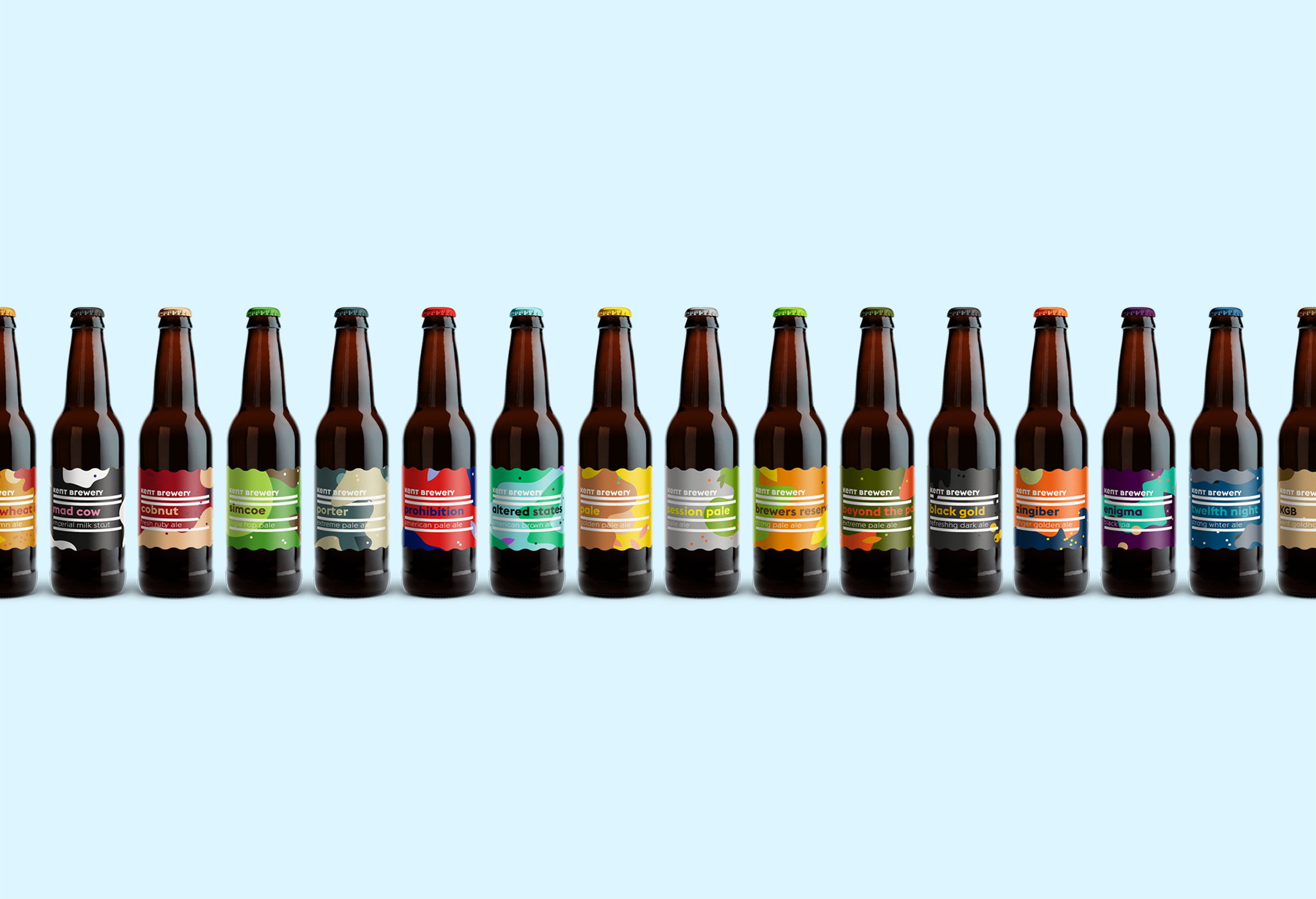
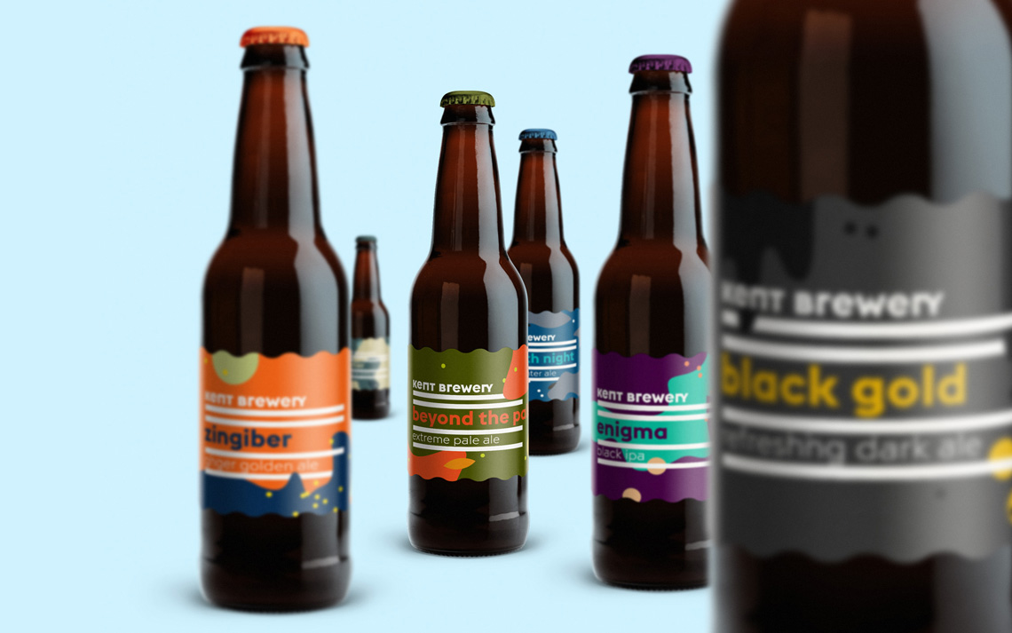
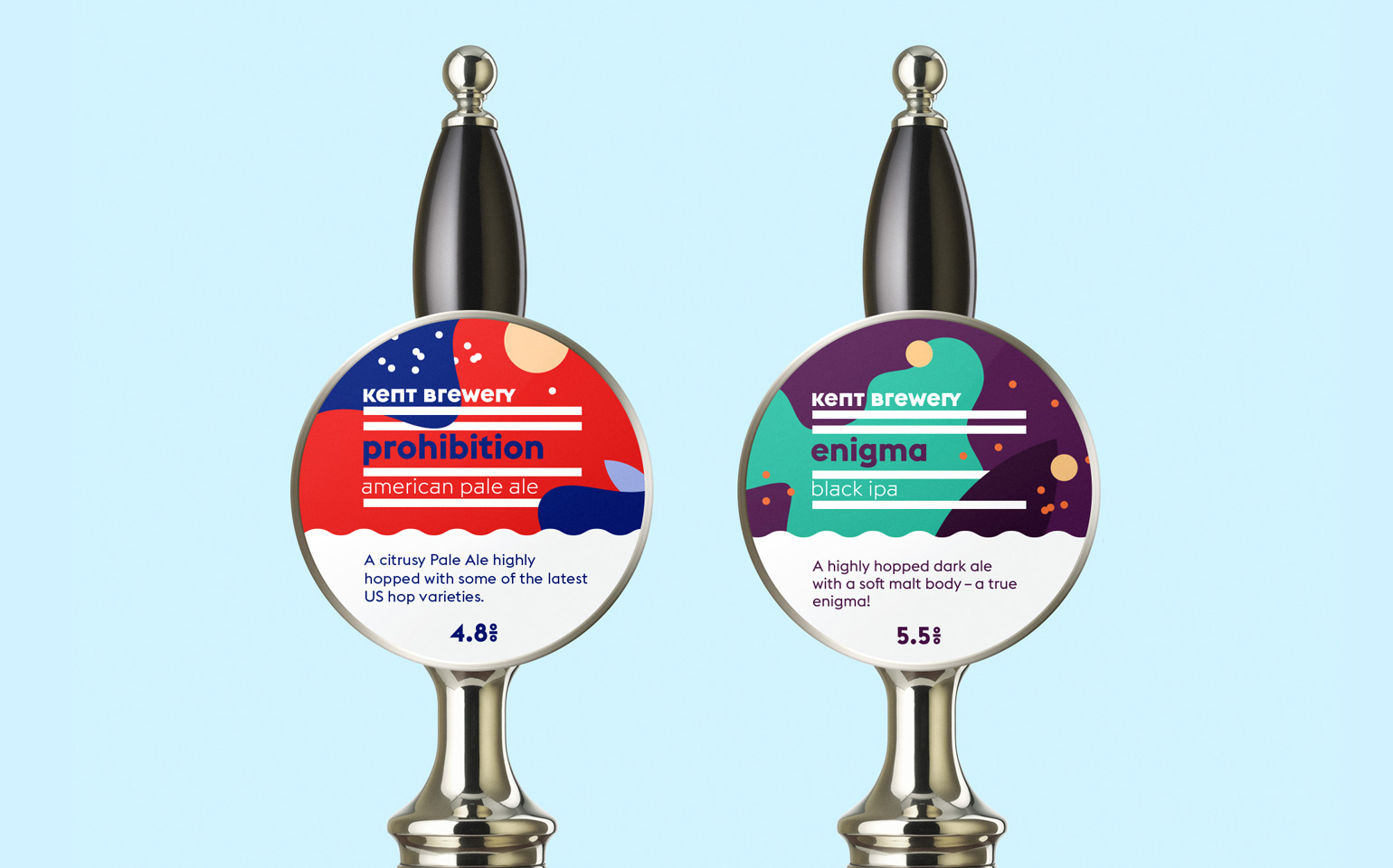
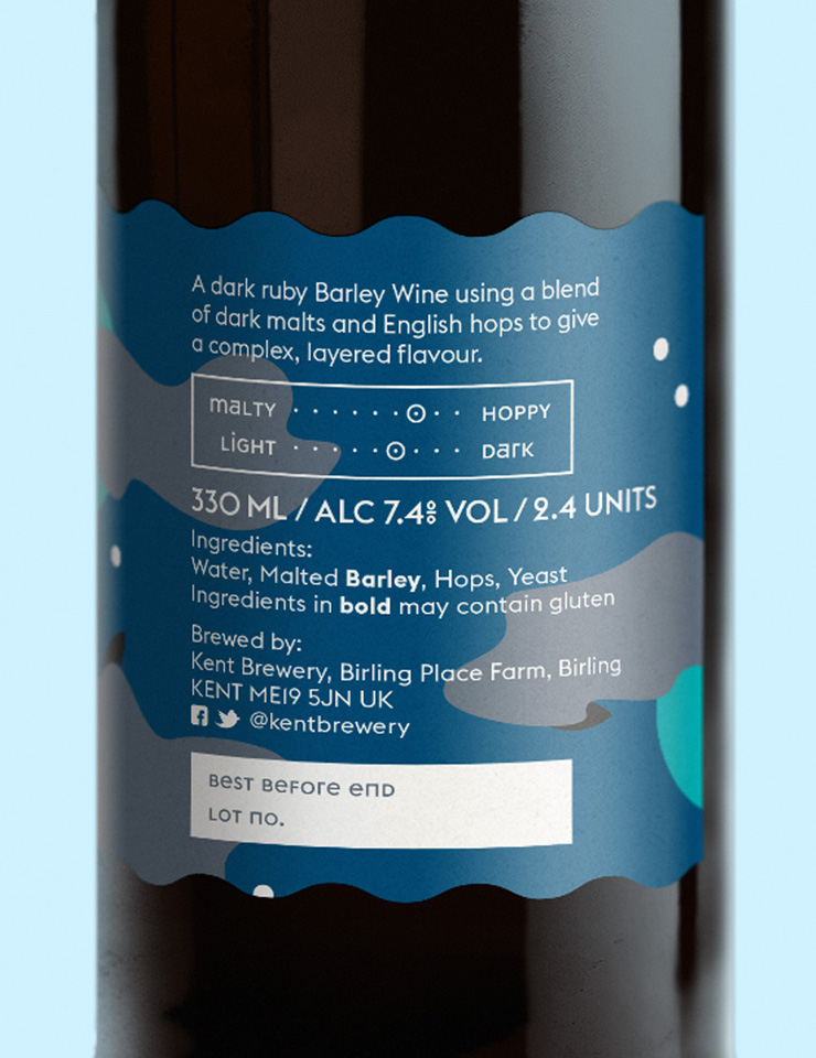
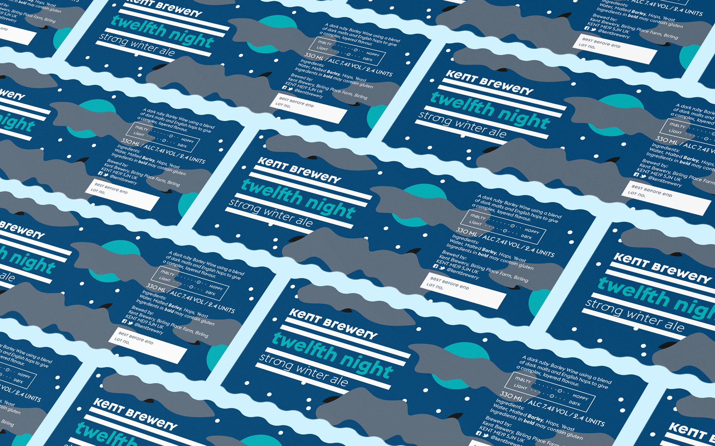
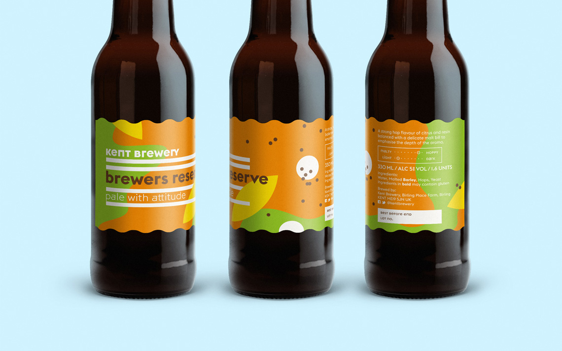
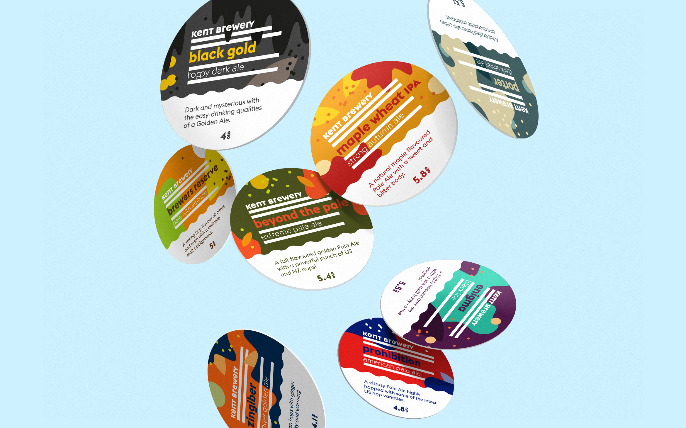
In 2015, Kent Brewery began bottling and invited me to radically redesign their original, rather traditional visual identity. I developed a dynamic design system based on the four essential ingredients of beer — water, malt, hops, and yeast. By rotating, cloning, scaling, and combining these colourful shapes, I created a wide range of unique patterns that remain visually connected. A five-colour palette ensures strong differentiation across an ever-growing range.
What began with 15 beers has since evolved into an ongoing project featuring more than 120 distinctive designs — each one part of the same bold visual language, yet with its own character.
My role
↳ Creative Direction
↳ Graphic design
↳ Illustration